
Whenever I speak with others about design, one of their main concerns is picking the right paint color. Today I am here to give you some tips on how to do just that.
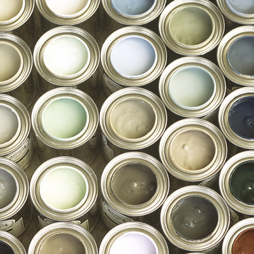
Photo from Apartment Therapy
Tip #1- Wait. Many times, people want to start the design process by picking a paint color. If you are just in love with a certain hue, that’s a fine place to start. But here’s something else to think about- paint is one of the cheapest design elements and you can get it in any color you want. So, you may want to consider finding an inspiration piece before you pick your paint color. For example- You may want to choose a gorgeous sofa for your living room before your paint. The sofa is much more expensive to change and it is something you will most likely have for years longer than your paint color.
Tip #2- Don’t get too bogged down. Unless you have absolutely nothing on your wall, paint is meant to be a backdrop. It is meant to set off the things in front of it. So don’t paralyze yourself with fear of choosing the wrong color. Most likely there are many options that will look lovely.
Tip #3- Don’t be afraid of bold. When you are picking out a bold paint color, you can easily get cold feet about your decision. But remember all the layers you will add to the space will tone down the intensity and be really beautiful rather than overwhelming. Take these rooms for example. I am sure before all the furniture and decor was brought in, the home owners felt a little (or maybe a lot) nervous about their color choice. However, after everything was moved in, these spaces definitely turned out to be bold and beautiful!
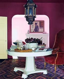
Photo from dominomag.com (now deleted)
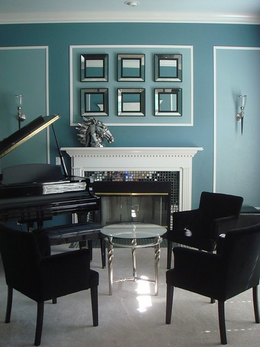
Photo from my portfolio

Photo from homedecorcourage.com
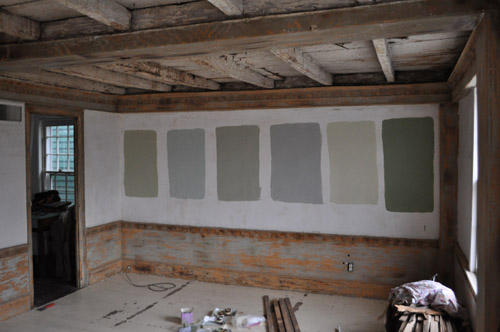
Tip #4- Samples save time and money. Many rooms have been repainted because someone decided to forego paint samples. The reality is that every space has a unique light that casts a color. This cast color will change the look of your paint dramatically. When you are at the paint store, you are under florescent lights but you probably don’t live with fluorescents. So, be sure to look look at your prospects in your own home at different times of the day. These photos below were taken at different times of the day. You can see how the bottom photos colors are more intense than the top photo colors.
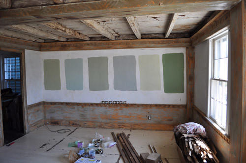
Photos above from katyelliott.com
Tip #5- Compare. Sometimes it is hard to see the undertones in specific colors. For example, gray can have: purple, brown, green, or blue undertones. But all we can see is plain old gray- that is until you compare it to another gray with a different undertone. I always compare my swatches and look at my options with my accent colors to ensure I am making the right choice.
Tip #6- Know your tendencies. I have painted a lot over the years, so I know that I have a tendency to go lighter than what I actually want. So, now I choose a color and go 1-2 shades darker.
Hopefully these tips will serve to help you pick a perfect paint color! Do you have any tips of your own to pass on? I’d love to hear them!
Of course, you must know that I love today’s post!
When it came to my kids rooms I let them choose whatever color they wanted for one wall. The other walls are a neutral dark beige/tan. I always wanted to paint my room when I was a kid and my mom never let me :(. My boys have one red wall and my girls have a purple one. It’s just one wall so it’s not a big deal to change and it was really fun picking them out!
Great tips!!