
Happy Tuesday Friends! I am finally ready to share the entire dining room I did for my good friends B and Anthony! You remember when we did their living room, right? Well, we had such a good time working together on that, we moved right on into their dining room and started on it!
Let’s take a look at the before and after. . .
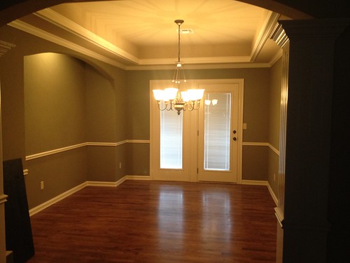
BEFORE
AFTER
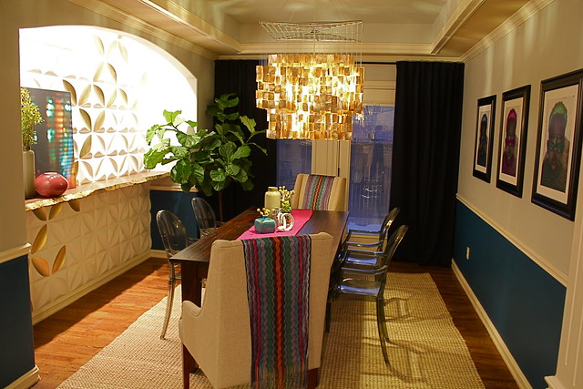
Since the dining room and living room are all part of the open living space, I wanted to make sure the two rooms coordinated color wise. For this reason, I used the same blue color below the chair rail.
I talked all about the nook and it’s features in this post. Basically, since the cut out created a obvious focal wall, I wanted to do something unique and super chic! My favorite part about the nook is that Anthony (the husband) ended up loving it! Why was he so taken with the tiles? Much to my delight, I realized that the pattern created by the tiles is the same shape the Pittsburgh Steelers use in their logo. The Steelers just happen to be Anthony’s favorite team!
Let’s compare. Logo. . .

Wall tiles. . .
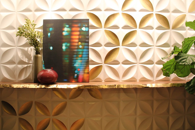
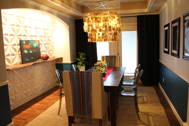
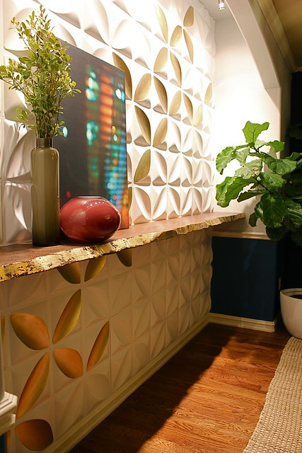
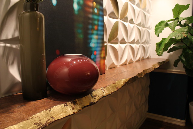
The focal wall went through quite a makeover. Once the tiles were up and the shelf was finished, I loved the look. But it felt like I needed to put something else along that wall. I thought about a huge piece of art, but I really didn’t want to cover up the super cool tiles. So, after a lot of contemplation, I decided that I would use gold paint to create a pattern within the pattern of the tiles. This allows me to keep the focus on the amazing tiles, but also allows me to break up the white a bit.
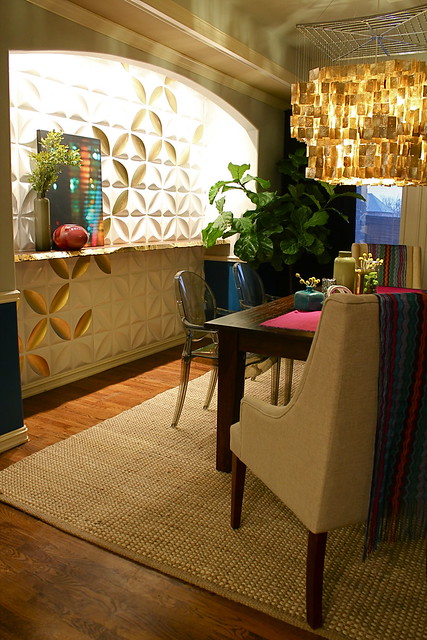
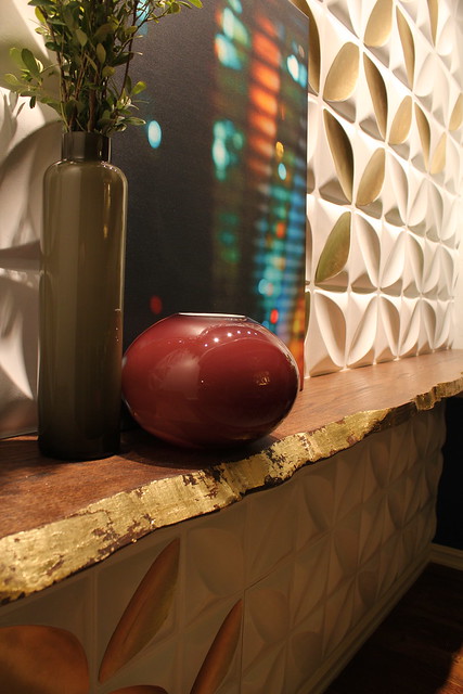
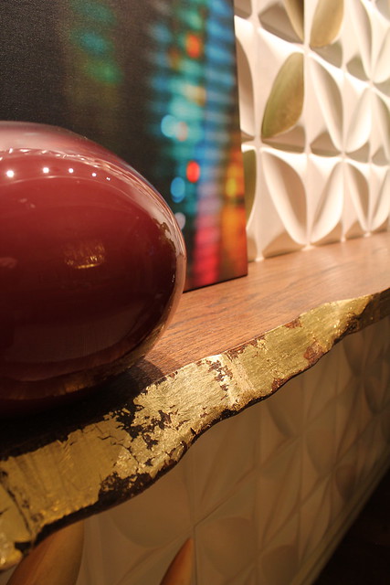
A beautiful live edge shelf that spans the entire opening. Gold leafing the front edge gave the organic piece a heavy dose of elegance and really highlights the beauty of the organic shape.
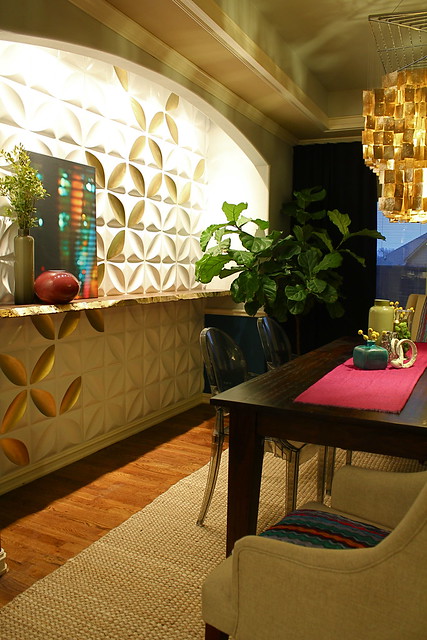
Other than the nook, the biggest change in the room came in the form of a giant shell chandelier! The gold brought the elegance, while the shell brought the casual. The squared off shape also kept the space feeling contemporary.
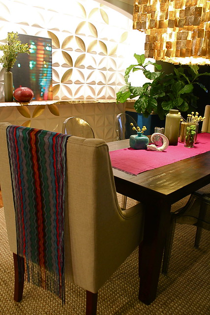
Gray colored ghost chairs provide seating for the space. Although they are super cool, they don’t take away from the other main focal points in the room.
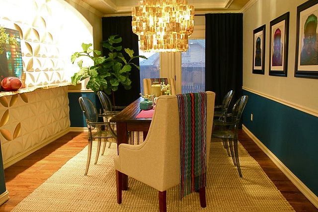
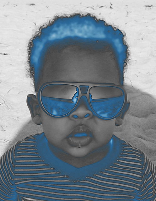
On the right wall, I did a triad of art. Of course there are countless possibilities when it comes to art ideas. But in the end I decided that B and Anthony’s little boy was the best choice to make this room meaningful to the family. Of course, I didn’t want the photos to be too normal, so I used photoshop to change up the colors. He’s pretty cute, right!
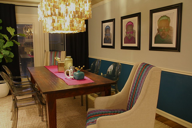
I love that this photo was taken at the perfect time, with a little drip of adorable drool about to fall from his plump little lips! 🙂
Some interesting vases, plants, and textiles are great complimentary pieces that bring in that extra layer of texture and really finish off the space!
So, there you have it! An elegant and chic space full of meaning and color! What do you think!?
Amazing! Thanks for sharing the rest of the room. Everything looks very well put-together.
Kara… this room ROCKS so hard! I love everything about it.
This comment has been removed by a blog administrator.
Sassy & Chic. Bold & Elegant. Love the great new ideas you come up with!
Sassy & Chic. Bold & Elegant. Love the great new ideas you come up with!
I have one word for this project: WOW! Ya’ll did an awesome job! Love it!!
This is killer! I love that chandelier, and all the colors and textures. awesome job! (as usual!)
Kara, this room is amazing! I absolutely love the gold leafing on the bar and the gold accents on the tiles. Your friends are lucky to have such talent available!
What’s Going down i’m new to this, I stumbled upon this I’ve discovered It absolutely useful and it has helped me out loads. I hope to contribute & assist other customers like its aided me. Good job.
Here is my homepage ; home remedies for acne that work
Pingback: Storied And Sports Filled Man Cave | Kara Paslay Design