
Hey Friends! Well today has not started off well. Out of the blue, my computer charger stopped working and of course I was running on no power. Ugg. So, instead of seeing photos of a brand new project today (which are on my computer- I am now using Tim’s), I am going to go over the “why” and the “why nots” of Jonny and Angelene’s space!
Now, this is where I always feel like I am boring people . While the layout, furniture choice, and material decisions are all super important to a final design looking great, I always wonder if the details of how I make my choices leave you guys bored to tears? Of course, I figure some of you read design blogs to actually pick up some tips and tricks to use in your own home. So, this post is for you!
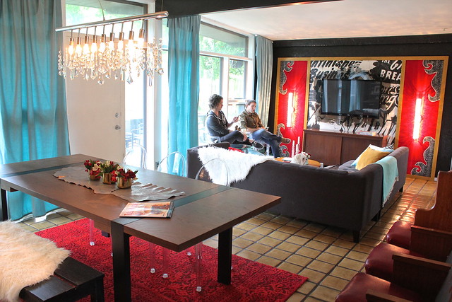
The first issue with Jonny and Angelene’s space was the layout. The sectional was really too large for the room and the fact that it was broken up left the space feeling disjointed. There was no flow to the room.
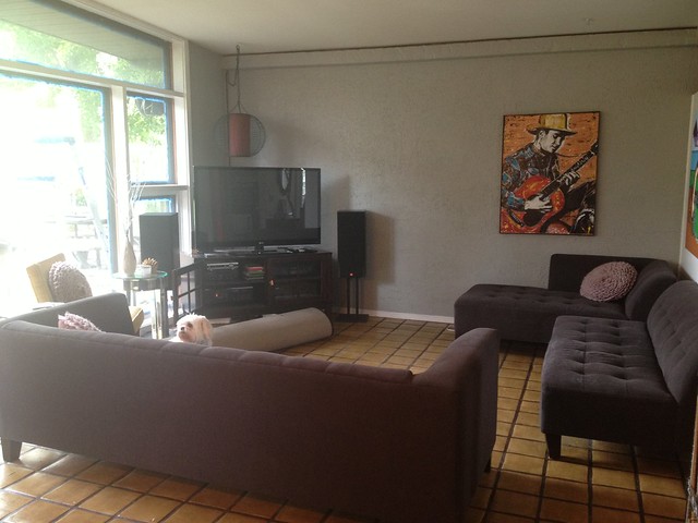
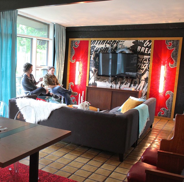
My solution to this was to get rid of the chaise part of the sectional (it now lives in a bedroom) and bring the couch back together. Floating it in the center of the room (instead of pushing part of it against the wall) gave us instant “walking paths” and keeps the space feeling open and airy, yet defined.
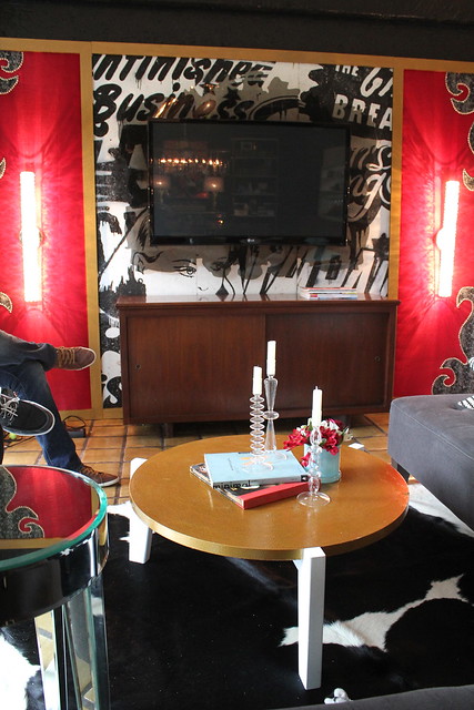
Another issue in the area was the lack of a focal point. The television looked like a black hole stuck in the corner.
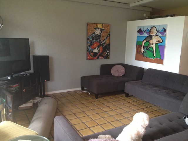
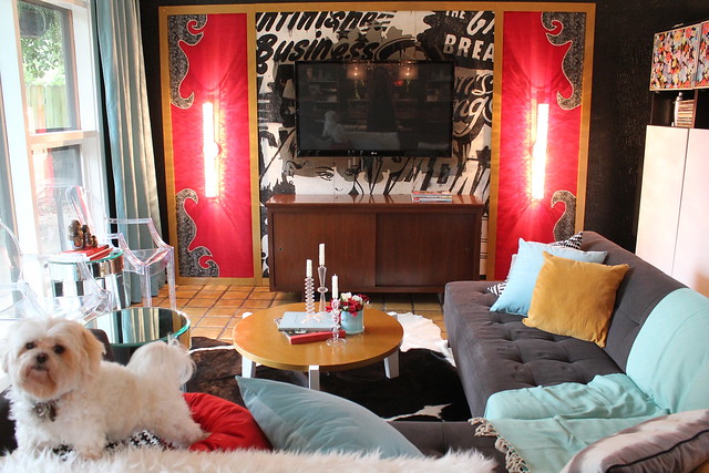
Instead of just doing something cool around the TV, I wanted to create a whole wall of interest. I feel like this keeps the TV from soaking up all the attention. Our focal wall consists of some pop art panels, upholstered panels adored with sconces, and a pretty rad acrylic TV frame.
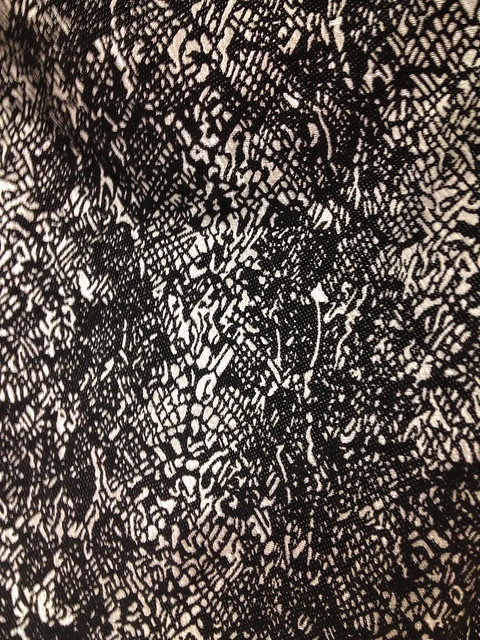
I chose the shapes for the upholstered panels based on a pair of crazy cool cowgirl boots that Angelene was wearing on our initial visit to the house. The snakeskin like pattern on the fabric is both country and rock n’ roll.
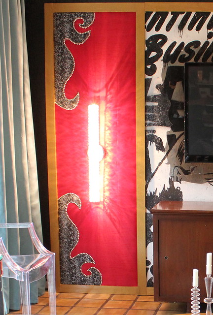
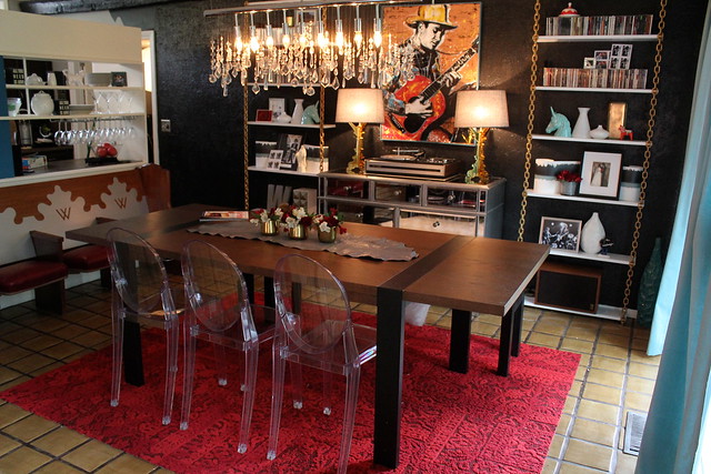
I picked the crystal sconces (which don’t photograph well) especially for Angelene. She loves a little (or a lot) of bling and these lights speak to the chandelier already hanging in the dining room.
I love, love the simplified baroque styled frame that we had cut out of acrylic for the TV. You can read more about that here.
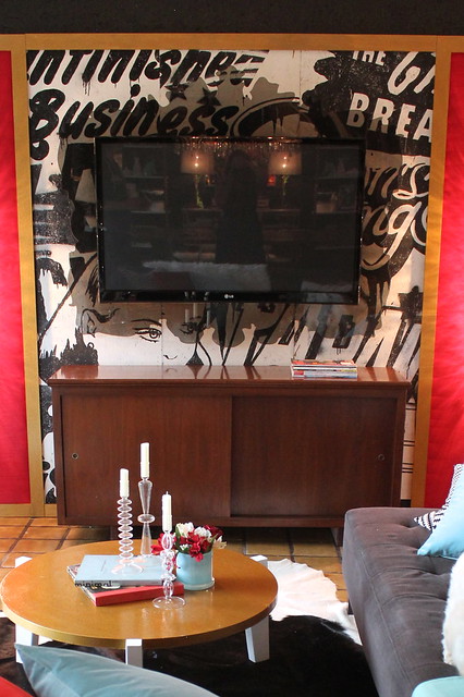
The media console was an easy choice. It holds and hides a ton of stuff, while also fitting in with the style of the house itself.
The windows in this space are amazing! They let in so much light and really make the space feel bigger. The couple wanted as much seating as possible in the space, but I didn’t want to block the light or the view with chairs.
Our solution? Lucite chairs!!! This not only makes sure our view stays in tact, it fits the style of our space perfectly. Plus, having lucite chairs in the dining area further units these two spaces making them feel like one!
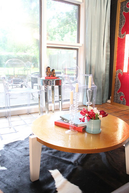
Although I didn’t want to block any of the light from the windows, I did feel like it was important to frame them with some curtains. These blue panels not only soften the space, they bring in a beautiful pop of color (which Angelene was really keen on)!
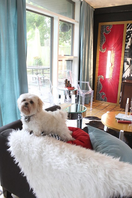
PS- I think the flokati rug, which matches Scooter perfectly, was a pretty great choice for the space as well! 😉 Haha!
Of course a cowhide rug also brought in a nice dose of country for Ms. Angelene.
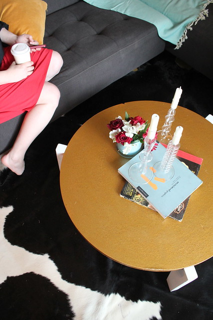
Finally you might recognize that coffee table! 🙂 It was mine, remember. . . .
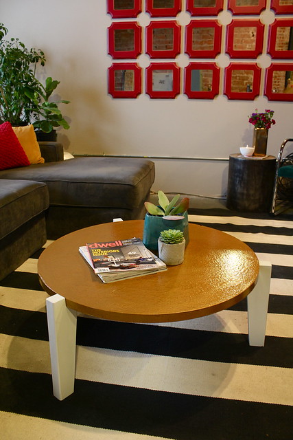
Well, when I started making my plan for the Wright’s space and picking out items that I thought would work, I kept wishing I had another coffee table like mine to give them. I thought the modern lines, gold top, and size would be perfect for the room. So, in the end, I decided to sacrifice my own home’s design for this space. I think it was worth it. 🙂
Come back tomorrow for some more design fun! 🙂
I don’t think going through the how and why is boring at all. I mean, I’ll never have a space EXACTLY laid out like this one is, but knowing all the little details I should be thinking about for furniture layout/selection is definitely helpful. This space is amazing, and knowing why you created it the way you did gives us a little window into your genius =)
Amazing job! I love it, I KNEW I recognized that coffee table in the original photos! I thought, hmm… maybe they made one to match? I love the chains you did, those are awesome. It looks like one piece of the couch set is missing, or did you guys reassemble it differently? Just curious. Spectacular job as usual, it must be so fun to work with you guys!
I love learning about how and why you make the decisions you do! It’s hard to go from an empty space, or worse, a space with bad design already in place, to a space that works and looks good. It helps to know what you started with and what you thought about as you put it together. Oh, and by the way, I did not even SEE those lucite chairs in front of the window until you pointed them out! Seriously! They were invisible! 🙂
Ack! As soon as I posted this comment, I thought, “I hope that doesn’t sound offensive… that part about bad design already in place.” I wasn’t saying that what the Wrights had in place was bad — just that it’s hard to come up with a design for a space that already has stuff in it. It’s hard for me to think that the TV can go anywhere other than where it currently is, if that makes sense! I’m probably worrying over nothing, but I just wanted to clarify! 🙂
Wonderful blog & good post.Its really helpful for me, awaiting for more new post. Keep Blogging!
House Plans Australia | House Plans Queensland