
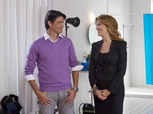
Because I know most of you can’t watch videos at work, I decided to go back to a written Design Star review this week. I also didn’t want to ask you to watch 2 videos in one week. Friday we will be posting our very first ‘TIL DESIGN DO US PART© episode! I figure this way you have all weekend to carve out 10 minutes of your time to watch our very entertaining 1st try at our own show!!

Ok, back to the matter at hand. The kitchen challenge finally comes calling this season in Design Star, but the situation has changed. In the past contestants have made over a kitchen for a “lucky” homeowner. I say “lucky” because this challenge always seems to end in disaster with a half finished space, dreadful tiling, and vent hoods hanging on by a prayer. But this season, as we have seen, is different and the contestants are asked to design a picture perfect kitchen for a photo shoot. They don’t have to install anything but the backsplash and therefore all their energy is allowed to focus on the actual design of the kitchens. We should be in for a real treat, right!?
Upon hearing the basis of the challenge I expect Emily to blow out her competition (she is a photo stylist). Then in the first five minutes of the show she clarifies that she has never designed a kitchen. Even so, the same rules still apply and she should be able to bring this win home.
Once again the designers are asked to choose an inspirational object. Courtland and Emily chose the Italian basket below.

Now if you are from Tulsa, Oklahoma or somewhere like it and you think of an Italian kitchen you’re mind immediately goes towards a Tuscan- Italian look. But if you live in New York or someplace like that your mind may go towards a modern Italian look (like this photo below).

Emily and Courtland’s final product ends up looking more tuscan but their backsplash tiles (which I love) and stainless appliances bring in a modern element.

Overall I thought this kitchen was bland and boring, which definitely doesn’t fit the Italian stereotype (thanks to Jersey Shore)! It’s basically all beige besides the flooring and the purple island. I know most people are thinking why in the world did they use purple paint. The reason (I suspect ) is because purple brings more life to a photo or piece of art rather than black which tends to dominate it’s surroundings and command all the attention. Many artists use dark purple hues instead of black in their pieces. It’s usually less obvious than this.
Michael, Casey, and Alex end up on a team and select the french basket to inspire their kitchen.

Anytime I think of a French kitchen I think of Julia Child’s kitchen. The picture below is from the movie “Julie and Julia.” The Art Director on this movie went to extremes to make sure the set looked just like the real thing and she did a phenomenal job!

Michael, Casey, and Alex did a great job making the kitchen look like it had a lot of activity going on- but once again the beige on beige on beige= BLAH! Julia’s kitchen has color, character, and life injected into it. The design star kitchen- not so much.

So, in the end Alex goes home. I would have much rather seen Michael go home because he seems to be taking over Nina’s role of “the mean one” and it’s just not attractive.

News flash Michael- The direction that your wood floor is laid is not that big of a deal. And personally I would have oriented it perpendicular to the island, not parallel (and apparently so would your buddies Courtland and Emily).
‘Til tomorrow folks! And if you are in the Tulsa area- be sure to tune into CHANNEL 2 this FRIDAY at 11:25 to see me give some great tips on DORM ROOM DESIGN!!!!
I love reading you comments on the show. I watch it with my 5 year old, and well, can’t really *discuss* it that much with her;). Anyhow. I agree with Michael being the new Nina (which I was SOOO glad to see go), it seemed as if anything Alex said, he had to disagree with in a very cocky way. Like that table and chair in the final picture. I like it, but it drives me crazy sitting there! I want to reach in and move it over so we can see the fridge. You know, the whole reason the kitchen was created… And his shell thing, maybe it’s because I’m not a designer (or that smart), but I didn’t get it. I got Alex’s, but the stainless steel appliances were kind of a given.
Maybe it’s because I lived in New York for 25 years, but I love the look of the modern Italian design. Even though Emily and Courtland’s look may have been a bit bland, it’s still a really beautiful design and finish.
Juliette Samuel
Can’t wait to watch YOUR show! I have to say, this season of Design Star is completley lackluster. I always liked that the Kitchen Challenge was a really hard. This season, it wasn’t just easy, the results were totally underwhelming. The designers tackled paint, a backsplash, and counter accessorizing (a total bomb for both groups). We need to get back to the old format… tougher challenges and WAY fewer group projects!
Ugh, Michael, I agree. And also agree on this season–what a horrible format to have everything a team design. Nothing like the real world. And I used to like Vern, but now, not so much. He’s so boring and mean on the show.
So glad you ladies like hearing my thoughts on the show- it’s good to know I am not just talking to myself here! 🙂 I love hearing all of your thoughts as well, so please continue to make your opinions known!! 🙂