
Happy Monday Friends! Not long ago I revealed these mirrors but didn’t discuss anything else in the space that Tim and I fixed up for some lovely clients.
THE MIRRORS
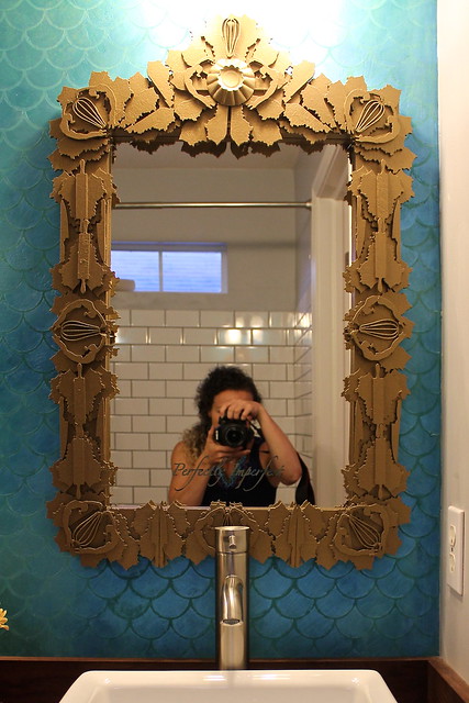
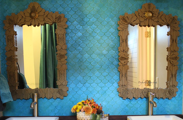
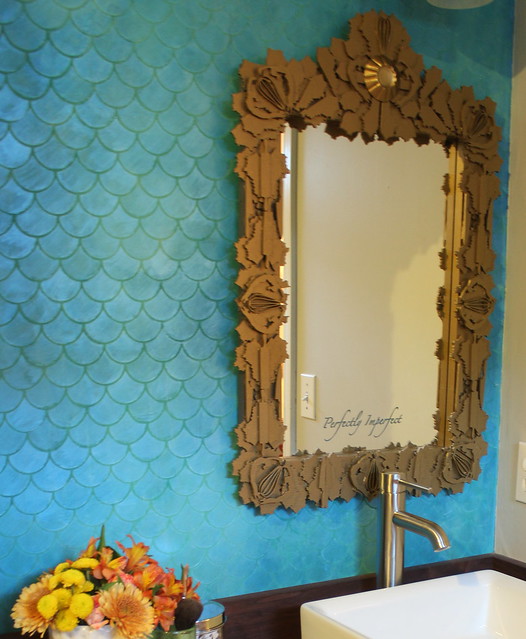
If you missed the previous post or haven’t been reading the blog too long, you should know that Tim and I use design to tell the story of our clients. Although we certainly want our spaces to be beautiful, more than anything- we want them to be meaningful! The mirrors definitely brought the meaning to the space (read more about that here) and we loved how they popped off the background so beautifully. Let’s look at that feature wall, shall we?
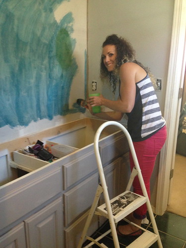
BEFORE
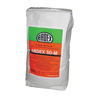
Before, this wall was covered in an extra large mirror. Functional, but certainly not fabulous. We removed the mirror and covered the wall in a one of our favorite products called ARDEX. ARDEX is a concrete product that we use often, on everything from walls to countertops! For this particular project, I actually used ARDEX’s SD-M in white.
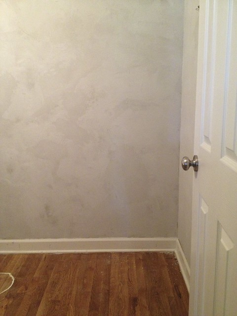
I mixed the product and troweled it onto the wall. I did a couple of coats just to make sure the whole wall was completely covered. Of course, I forgot to take pictures of this step, but the end result looked a lot like this wall I did in a parlor bathroom.
Using the white color allowed me to tint the product after it dried. Of course, I could have tinted the gray product as well, but I wanted to make sure I got a nice, bright and saturated coloring. I used Rit Dye to tint the concrete. I simply mixed the dye with a little water and used a paint brush to apply it to the wall.
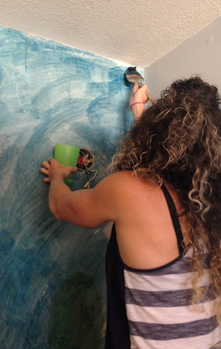
I then used a rag to blend multiple colors in blue and green hues to create an ombre like effect.
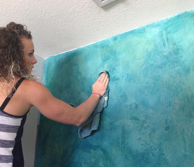
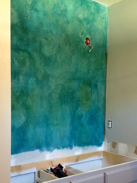
I was quite pleased with the result…but I wasn’t finished!
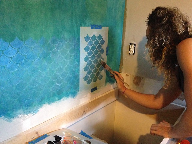
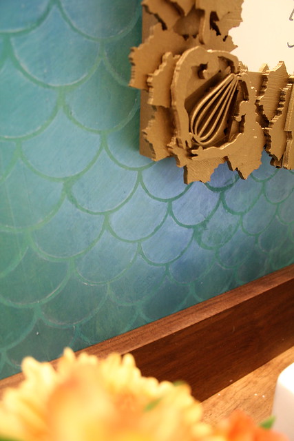
I wanted to use a metallic paint to bring in some bling and juxtapose the watery finish of the walls. I used Modern Masters Metallic Paint in the Flash Blue color and a Royal Design Studio’s stencil. To go along with the watery feel, I decided a fish scale pattern would be perfect. You can find the specific stencil here and the order Modern Masters paint here.
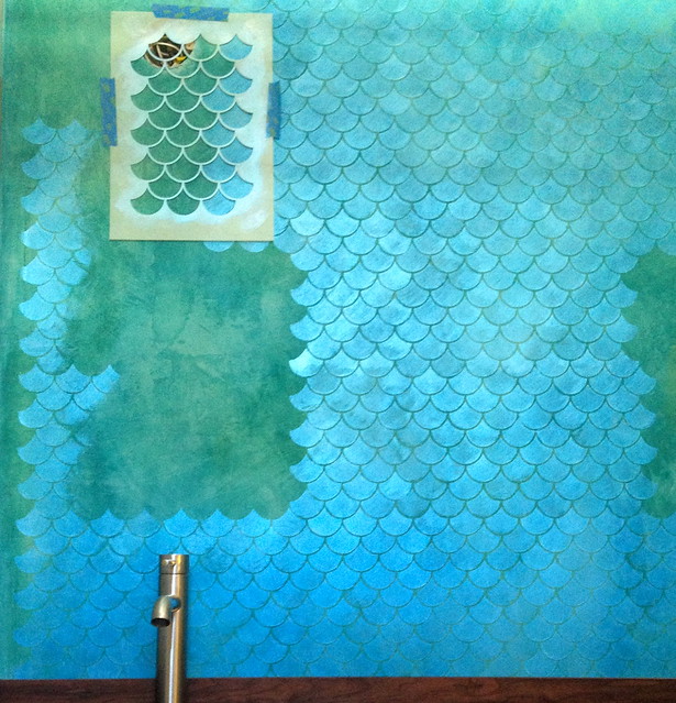
I really love how the metallic paint causes the pattern to have movement. As you walk through the room, the light catches the metallic paint at different angles and becomes more pronounced or more subdued.
So, that’s how the feature wall came to be. There’s still a ton to share in this space, so stay tuned friends!
I completely LOVE your unique style. It is current or ahead of the curve while glamorous. Keen how you use the latest in technology to personalize design. Keep it coming!
So pretty!!!Thanks for sharing, I had been wondering about this one! I love your style, very non cookie cutter – which is refreshing! 😀
-Jesse
Wow.
Brilliant work Kara.
This is stunning! I am dying to use the royal design studio scallop stencil to cover the hideous slate tile backsplash that came with my new apartment and came across your gorgeous design. I have been trying to figure out how to “level” the wall -smooth it so you cannot detect the four inch tile and grout lines under the stenciling. Do you think Ardex would do the trick? Have you ever used it over stone tiles? So glad I came across your work. You have an amazing style! Thanks in advance!